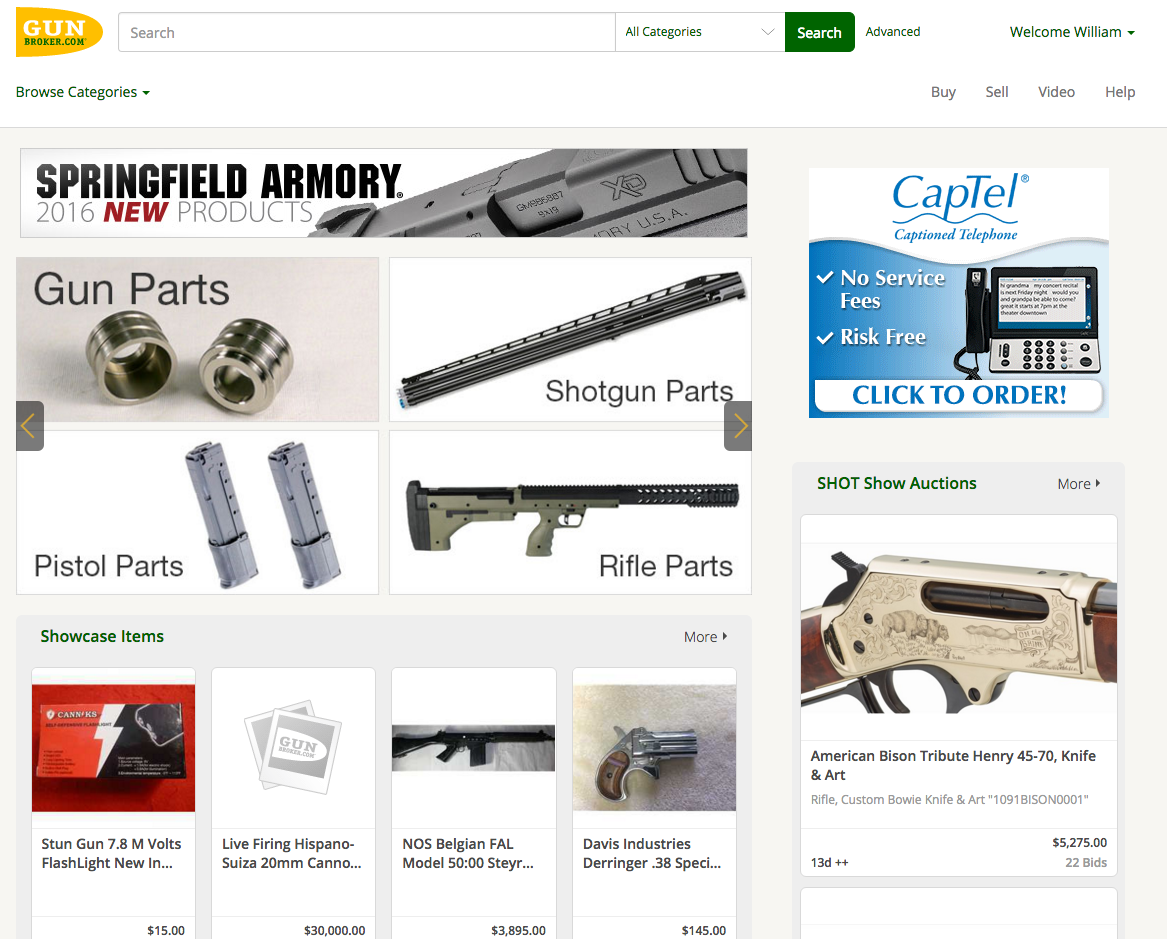
You’ve certainly noticed a few changes to the home page of GunBroker.com. With the introduction of Version 5, we will begin the restructuring of the site to a more responsive design that will create an easier, more uniform experience whether you are using a phone, tablet, or your desktop computer. We are trying to think and speak “mobile first.”
The new design also gives it a cleaner look to focus buyers on your product listings. Let’s go over some of the changes to acquaint you with the new home page.
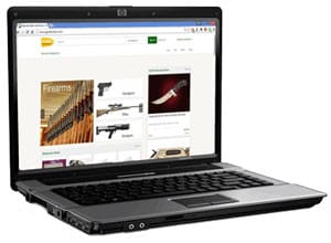
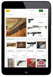
Caption: How the new site looks simulated on a laptop, iPad Mini and iPhone5 as examples.
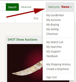
When you first visit the site, you will see in the upper right corner next to the search bar is your sign-in/register. Once signed in, this changes to the Welcome Menu. This new menu is the equivalent of your previous header item “My GunBroker.” Click on the dropdown anywhere and you will find My GunBroker, My Account, My Buying, My Selling and Checkout sections of My GunBroker along with My Watch List, My Searches, My Support, Feedback and Shipping. All of these are now one click away from any page on the GunBroker.com site. Also on this menu is the new location for Sign Out.
You will notice it is different on a smart phone, where the sign in/register and welcome menu show up as 3 lines. Just click on the lines to get the menu to appear.
We kept the four most popular items in the header. They are: Buy, Sell, Video and Help, and can be found immediately under the Welcome menu.
Caption: Old Website Header and access to My GunBroker
New Slideshow to Access Content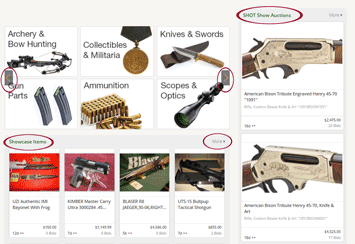
In the center of the page, we added a slideshow for strong, visual access to the most viewed categories and listings. To navigate through the slideshow, simply click on the arrows (left or right) until you see what you want. There is also a drop down menu in the header (Browse Categories) where you can drill down quickly to exactly what you want.
Next, we changed the layout of Showcase items from a line-by-line view to a gallery view. That way we are able to show larger photos and more items on the home page. At the top of this section is a “More” link to access the full list of items.
Third, is the dedication of real estate on the right side of the page for charity auctions supporting hunting, conservation and shooting sports causes.
New Comprehensive Footer
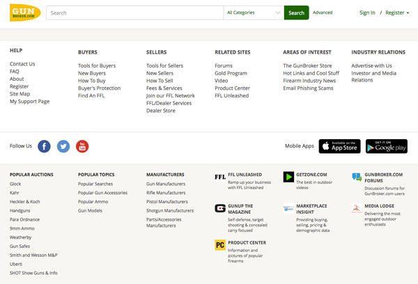
The footer is completely redesigned. Instead of having links and menus in the header, in the menu on the left, and in the footer, we combined them all and added some new ones. We also expanded all of them be visible in the footer.
The former header links for the Product Center and Community (forums and social media) can be found in the footer. Other links now in the footer include Tools for Buyers, Tools for Sellers, Join our FFL Network, Gold Program, Contact Us, and the Firearm Industry news.
Combining all those links in the footer allowed us to expand the center section, again to focus buyers on the items you are selling.
We will continue to roll out the new website design over the upcoming months. During this time, there should be no interruption to your sales or service, we’d love to hear your feedback.


